
Zara Usability Research
KEY TAKEAWAYS
- While users were able to successfully complete most of the assigned tasks, they were dissatisfied with the overall experience
- A significant issue for the users was the inability to quickly locate products
- This issue primarily stems from a lack of filters for product search results, confusing product thumbnails, and the absence of product images from different angles
- Recommendations:
- Add filters to help users narrow their search results
- Remove distracting elements from product thumbnails, and always make sure that the products are front and center
- Have more pictures of products from all relevant sides/angles (e.g., front, back, side)
- Recommendations:
- This issue primarily stems from a lack of filters for product search results, confusing product thumbnails, and the absence of product images from different angles
- Users were confused by the concept of a ‘drop-off point’ in the return policy page, which heightened their distrust in the brand and led some to contemplate reaching out to customer support for clarifications
- Recommendation:
- Simplify the language used on the return policy page and provide clear explanations of any technical terms
- Recommendation:
BACKGROUND
Product: Zara.com (desktop version) is an e-commerce site that sells clothes, shoes, and accessories
Research objectives:
- Assess Zara.com's usability using established metrics and determine if the usability metrics exceed a set of benchmark values
- Uncover the top 5 usability problems that impact the ease of use of Zara.com and provide a list of recommendations for each
METHODS
Research methods:
- Moderated usability test (remote): Measure usability & pinpoint areas where users encountered difficulties on the website
- Benchmarking: Determine if the usability metrics for Zara.com outperform established benchmark values
Tasks:
- Task 1: Find a black dress for under $50 (including shipping)
- Task 2: Change the size of an item in the shopping cart
- Task 3: Find and learn the return policy
- Task 4: Pay for the items in the shopping cart
Measuring usability & benchmark: According to the International Organization for Standardization (ISO), usability has 3 components: effectiveness, efficiency, and satisfaction (ISO 9241-11)
- Effectiveness was measured using task completion rate (i.e., the percentage of people who successfully complete a given task)
- The benchmark for task completion rate was 78%, which is the average task completion rate calculated from approx. 1200 usability tasks (Sauro, 2011a)
- Efficiency was measured using time on task (i.e., the average amount of time it takes people to complete each task)
- I was unable to find a suitable benchmark value for time on task so no benchmarking was done for this metric
- Satisfaction was measured using the System Usability Scale (SUS; Brooke, 1996)
- The benchmark for the SUS score was 67 (Sauro, 2011b)
Determining the severity of pain points: I used the severity scale to determine the severity level for all of the usability problems found:
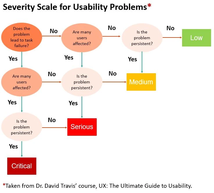
.
Screener criteria: The ideal participants were those who possessed the demographic and behavioral attributes of Zara’s target customers. This means, they must:
- Identify as a woman
- Be between 18-40 years old
- Shopped online for clothes at least once in the past year
RESULTS & RECOMMENDATIONS
Demographics:
- Number of Participants: 5
- Gender: 100% of participants identify as a woman
- Mean Age: 30 years old (Min-Max: 23 -34 years old)
- All participants had shopped online at least once in the past 9 months
Research objective #1: Assess Zara.com's usability using established metrics and determine if the usability metrics exceed a set of benchmark values
- 1. Effectiveness - Task completion rate
- For tasks 1, 2, and 4, all five participants successfully achieved the task goals
- However, the current task completion rate did not significantly surpass the benchmark rate, largely due to the small sample size
- For task 3, there was a 0% completion rate due to participants' failure to understand the meaning of a 'drop-off point'
- This usability issue, along with others, is discussed in detail later in this report
- For tasks 1, 2, and 4, all five participants successfully achieved the task goals
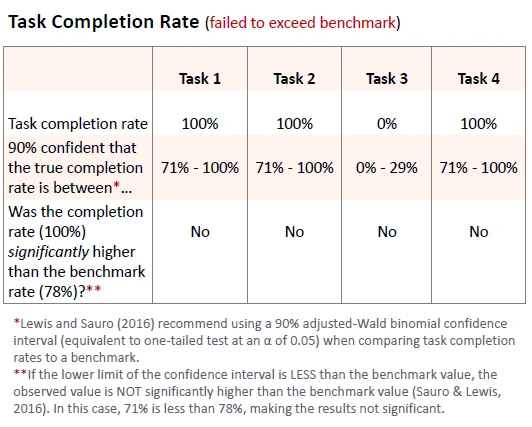
.
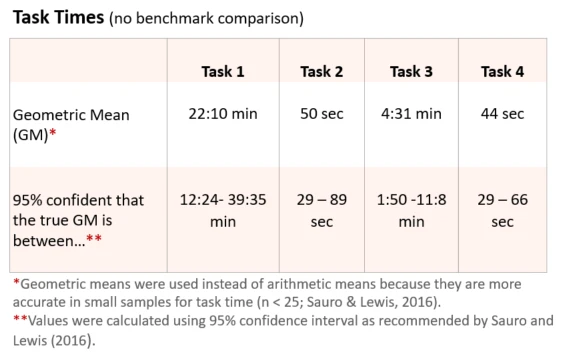
- 2. Efficiency - Time on task
- Below are the average times for each task
- Task 1 and 3 took the longest, which is not too surprising given the numerous usability issues participants faced during these tasks
.
.
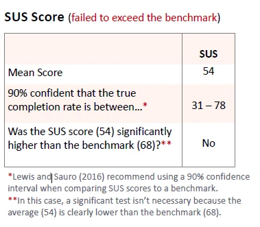
- 3. Satisfaction - SUS
- The average SUS score (54) was lower than the benchmark score (68)
- This difference could be attributed to various usability problems that participants encountered
- Addressing these major usability issues could potentially result in long-term improvement in the SUS scores
Although participants were able to complete most of the tasks successfully, they were largely dissatisfied with the overall experience, as evidenced by their low SUS score.
In the following section, let's examine the usability issues that may have contributed to their dissatisfaction.
Research objective #2: Uncover the top 5 usability problems that impact the ease of use of Zara.com and provide a list of recommendations for each
1. Jargon
- Some participants had trouble understanding the concept of a 'drop-off point,' how far it is from their home, and the implications for the return process if they were to select this option
- EFFECTS: This issue led some participants to contemplate reaching out to customer support for clarifications. One individual shared that the lack of clarity had led them to reconsider their support for the brand, as they believed Zara might be intentionally concealing the return process
- SEVERITY: Serious
- RECOMMENDATIONS: It is recommended that Zara clearly define 'drop-off point' and the associated return process under the heading 'At a Drop-Off Point' on the return policies page to eliminate confusion
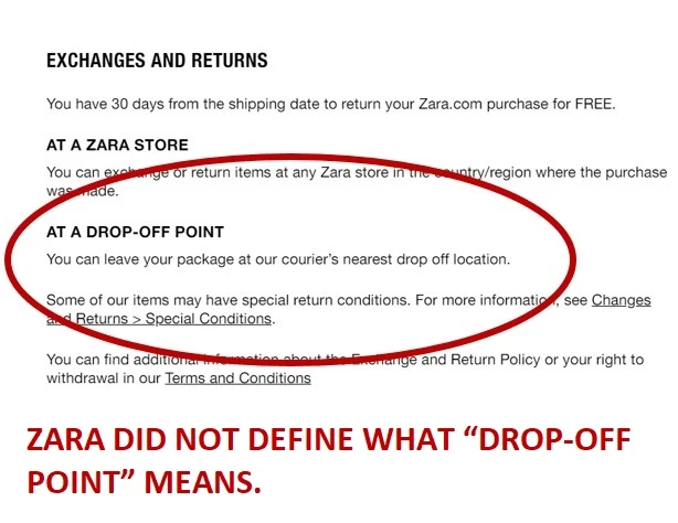
“What exactly is a drop point? Am I leaving it on the freaking porch for my mailman? I don't know. It seems like a weird company-specific thing. Now, I am wondering if I can take it to my post office and have them ship it out.“
2. No Filters
- While using the search function to browse for dresses, participants looked for ways to filter the search results by price and style. The absence of filtering capabilities led participants to sift through all of the search results, causing frustration for some who felt it was a time-consuming process
- EFFECTS: The lack of filters annoyed users, made browsing more time-consuming, and may cause people to miss products that they were looking for
- SEVERITY: Serious
- RECOMMENDATIONS: To enhance usability, consider adding filters for size, color, and price. Consider placing these filters in either the bottom left-hand or top right-hand corners of the screen, as participants consistently looked for filters in these areas
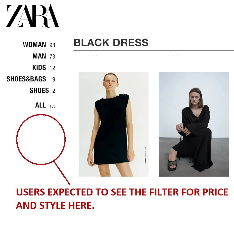
"I feel a little bit bothered that I can’t filter for price because I would like to reduce my options. I don’t like having this many options because it means I am going to spend a lot of time.“
3. Confusing Thumbnails
- Many thumbnails had distracting elements like unusual lighting, poses, and backgrounds, which hindered participants' ability to see the product clearly
- EFFECTS: This issue led some participants to skip relevant products, which made them spend more time browsing than necessary
- SEVERITY: Serious
- RECOMMENDATIONS: The Zara team should select thumbnails with the products front and center. Additionally, the pictures should be free of any distracting visual elements unrelated to the product
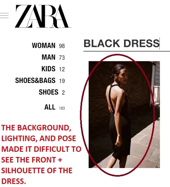
“A lot of these dresses are on people but the way they’re posed, it’s hard to tell what it looks like on a person. So, like, this one, I can’t really tell what it looks like, or this one. So I am probably going to ignore it anyway.”
4. Inadequate Product Images
- While on the product page, participants were taken aback by the frequent absence of images displaying the back of the dress and the lack of clear images showcasing the fabric texture. One participant cited the lack of back pictures as one of the reasons she wanted to discontinue browsing and shopping
- EFFECTS: This issue prevented participants from being able to understand what they were purchasing. For those who did make a purchase, it could result in a higher rate of returns due to the lack of product information. For some, it may even discourage them from further shopping
- SEVERITY: Medium
- RECOMMENDATIONS: Include pictures of products from all relevant angles (e.g., front, back, side) and ensure that at least one image depicts the fabric texture
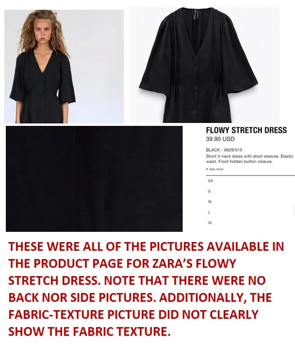
“I am still browsing. It's not like I am sold. I can't even see the back of the dress…That would be nice to know. It's a lack of info. It's a lack of being able to see."
5. Semi-invisible Search Bar
- Some users noted that the search bar was semi-invisible and challenging to locate. This was because the search bar lacked a surrounding box, making it nearly invisible when the homepage background is in the same color
- EFFECTS: The present design impacted search discoverability, making finding products difficult
- SEVERITY: Medium
- RECOMMENDATIONS: Encase the search bar in a box and ensure that both the search bar and the background are fully opaque

"In the first picture, because of the sun in the picture, I couldn't see that it actually says ‘search’ there, which is very important for the opening page. Looks like 'march’ for example so that's not nice."
RESEARCH IMPACTS
Addressing the usability issues found in this project would help increase sales and reduce support costs for Zara. Here's how:
- Making the search box more visible, adding filters, and using more informative thumbnails would contribute to higher sales as they enable users to quickly find products that suit their needs
- Adding product pictures from all relevant angles directly increases sales by allowing users to have a better look at products and feel more confident in their purchase decisions
- Providing a clear definition of a ‘drop-off point’ and outlining the return process can foster trust in the brand and improve brand perception over time. Furthermore, it will reduce customer support costs, as fewer people will feel the need to contact customer support to inquire about the return policies and process
MY LEARNINGS
- Effective moderation involves knowing the right moments to probe participants for additional information. I found that it's crucial to avoid interrupting participants when they are deeply focused, as they may forget what they are doing
- Collecting information on the devices participants use to join the study is crucial for remote usability testing. This is because it can be difficult to tell if the usability issues raised by the participants were due to the Zara website or the participants’ personal computer or internet connection
- A larger sample size is essential for usability studies with a quantitative (summative usability/benchmarking) component. While five people are considered acceptable for many formative usability tests (Nielsen & Landauer, 1993), a larger number of participants are needed to properly conduct summative usability and benchmarking studies (Sauro & Lewis, 2016). This is because statistical significance is harder to achieve with a small sample size. This is why the task completion rates for this study (100% for Task 1, 2, and 4) did not significantly surpass the benchmark rate (78%), despite the noticeable large difference between the two rates
- Note: I anticipated that this might be an issue when planning the study; however, given that this was a personal project, I decided to proceed regardless. If I were planning a similar project for stakeholders, I would collect a larger sample size
REFERENCES
- Brooke, J. (1996). SUS: A ‘quick and dirty’ usability scale. In P.W. Jordan, B. Thomas, B.A. Weerdmeester, and I.L. McClelland (Eds.) Usability Evaluation in Industry (pp. 189-194). London: Taylor and Francis
- ISO 9241-11:1998 Ergonomic requirements for office work with visual display terminals (VDTs) --Part 11: Guidance on usability
- Lewis, J. R. & Sauro, J. (2016). Excel and R Companion to the Second Edition of “Quantifying the User Experience: Practical Statistics for User Research”. Denver, CO: CreateSpace
- Nielsen, J., & Landauer, T. K. (1993). A mathematical model of the finding of usability problems. In Proceedings of the INTERACT'93 and CHI'93 conference on Human factors in computing systems (pp. 206-213)
- Sauro, J. (2011a). What is a good task-completion rate? Measuring U. Retrieved from http://www.measuringu.com/blog/task-completion.php
- Sauro, J. (2011b). A Practical Guide to the System Usability Scale. Denver, CO: CreateSpace
- Sauro, J., & Lewis, J. R. (2016). Quantifying the user experience: Practical statistics for user research. Cambridge, MA: Morgan Kaufmann
Last updated: Nov. 2020